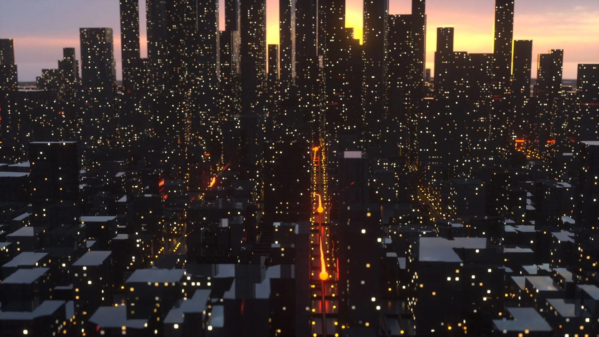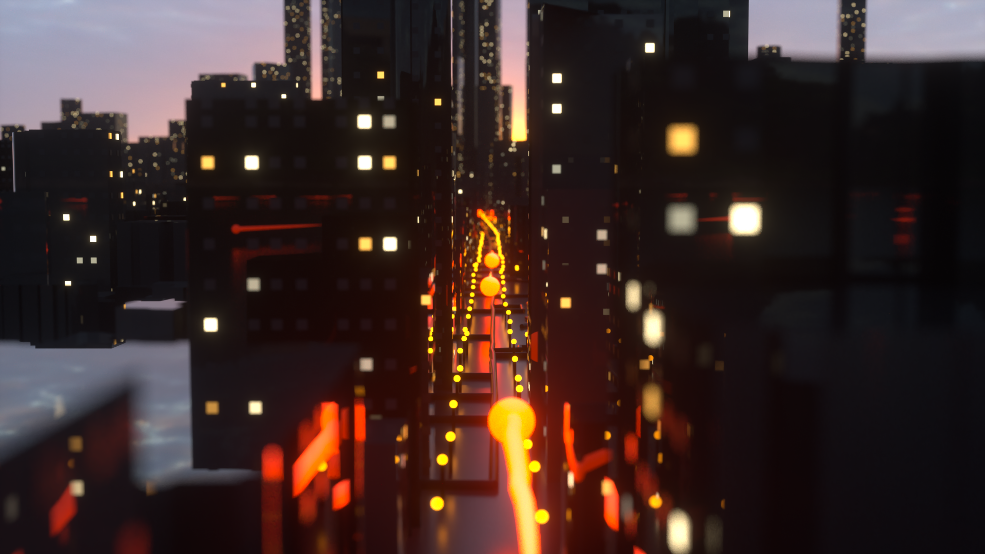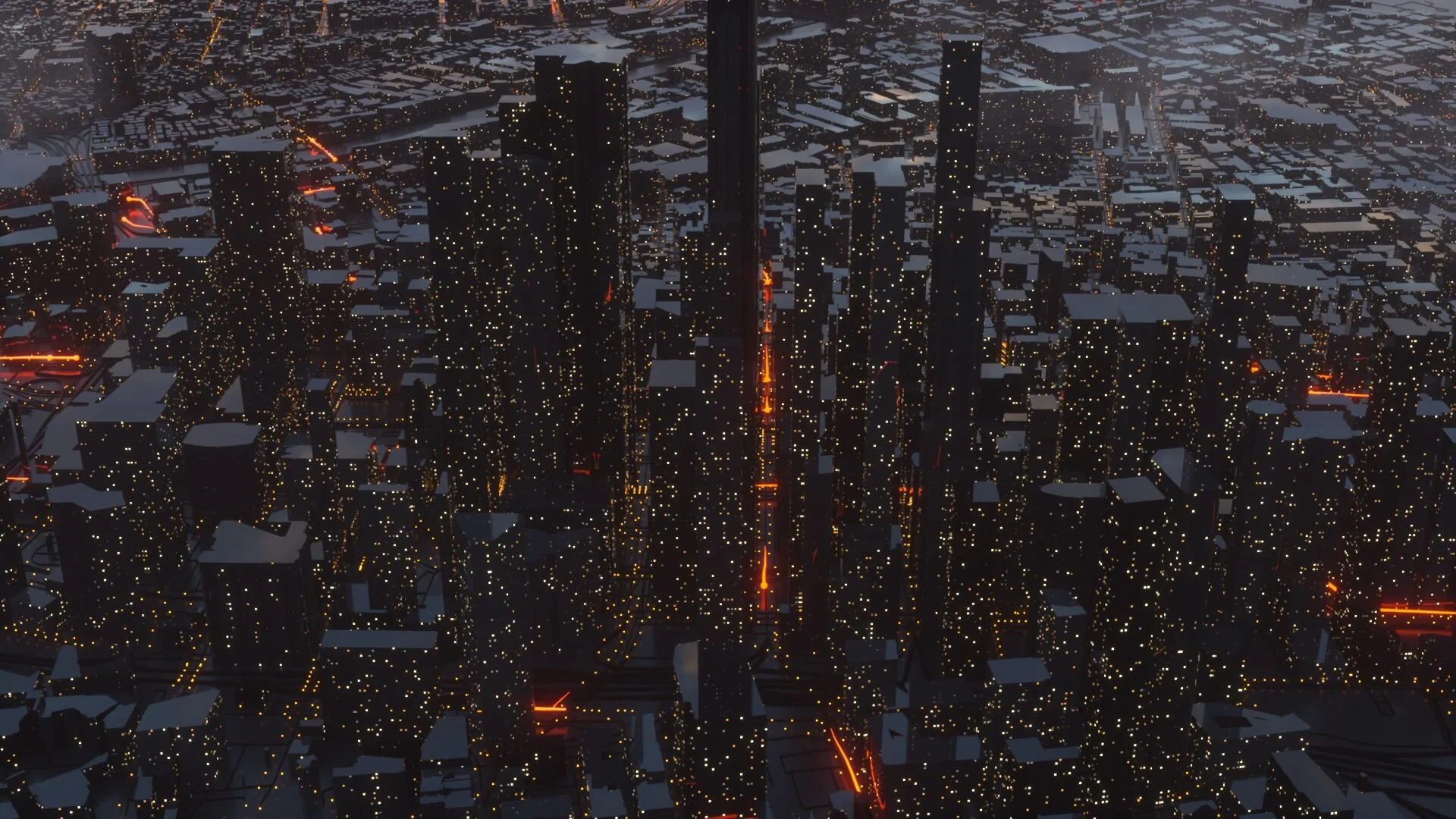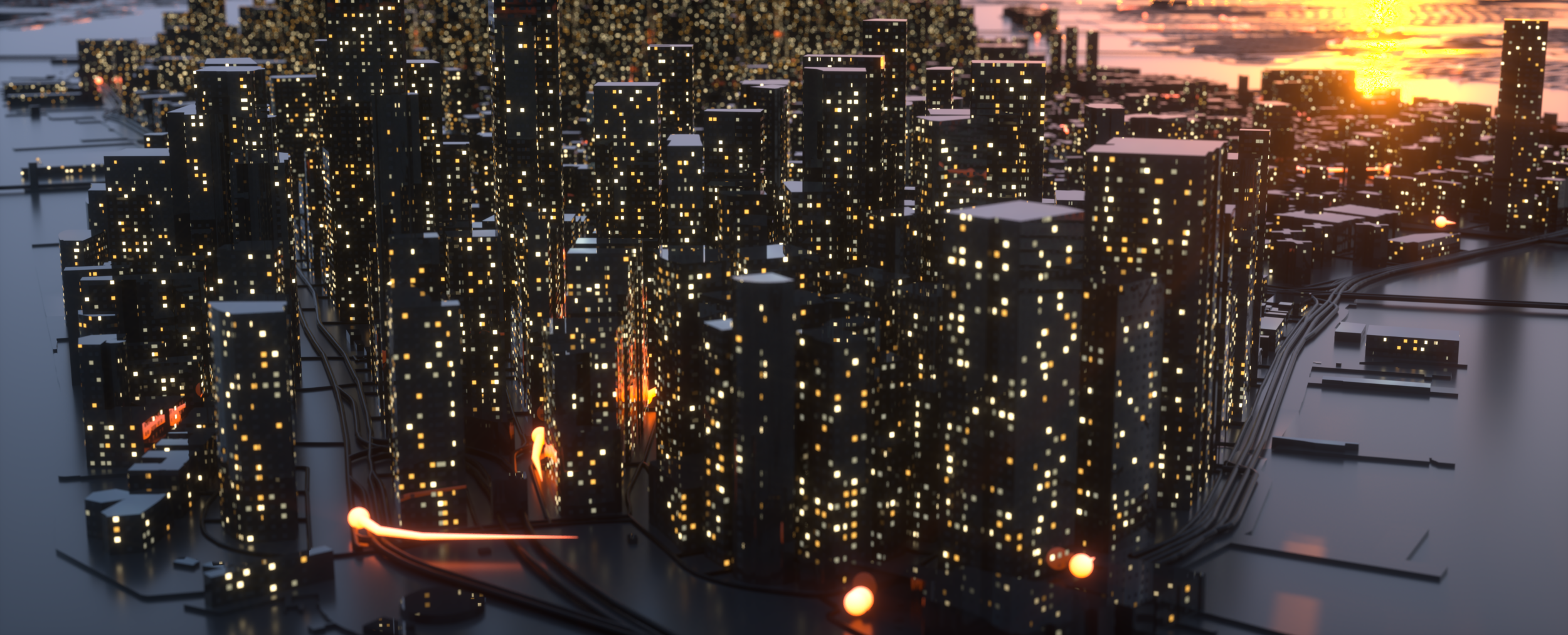
Window Cities
Having produced a lot of 3d city visualisations in the past and with some new workflows developed for animating transit data I wanted to marry them up to create a more immersive animation. I saw a little concept visualisation promoting a new track by Kalax, it was a procedural city with twinkling windows. I loved the idea of creating windows for buildings and something I hadn’t really thought of before.
So how do you create windows in buildings without the data to support it - very hackily! I’m not sure how interesting this process is but I thought I would share it. As with most of my 3d workflows this was done in Houdini.
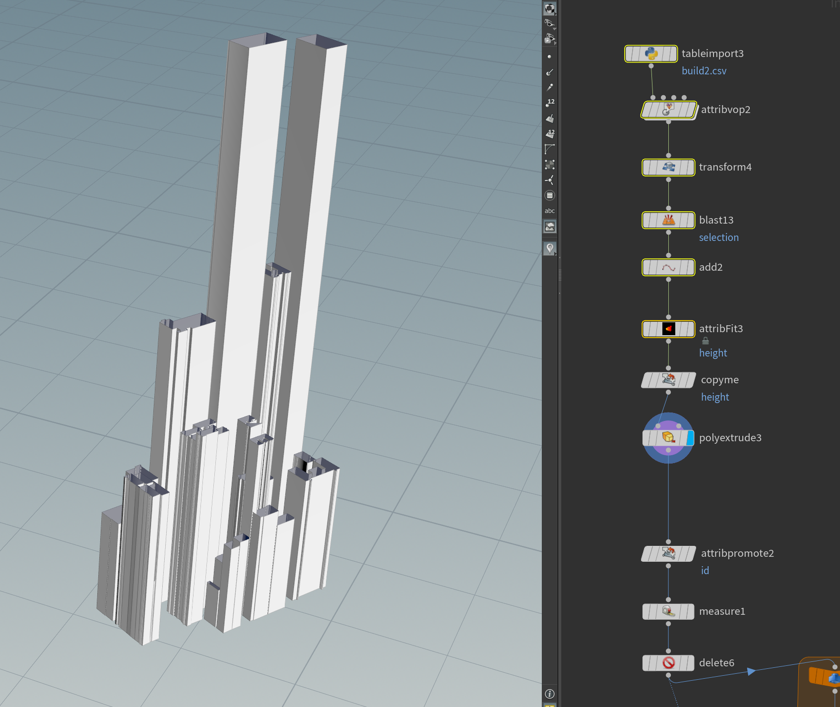
First we need some geometry, I import some building data - as CSV data. I have building footprint vertices, a unique ID and the height of the building. 'Poly extrude' does the hard work with creating the building faces, I just make sure not to cap them on the top as I don't want windows here.
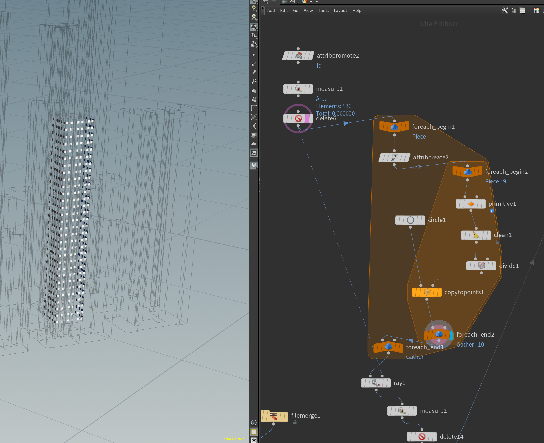
I then use loops to cycle through the building faces and divide this geometry up into equal rows and columns using the 'brickier' function. I then clone squares onto each intersect which will form my windows.
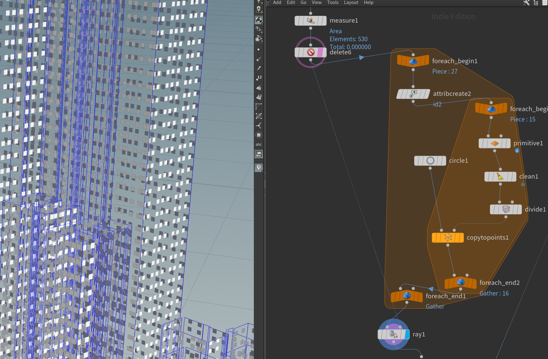
The general problem with this is you get a lot of overlap around the edges. So I use a 'ray' function to cast the square windows onto the face of the building, this cuts the squares down so they fit exactly. Any squares below a certain area threshold are deleted.
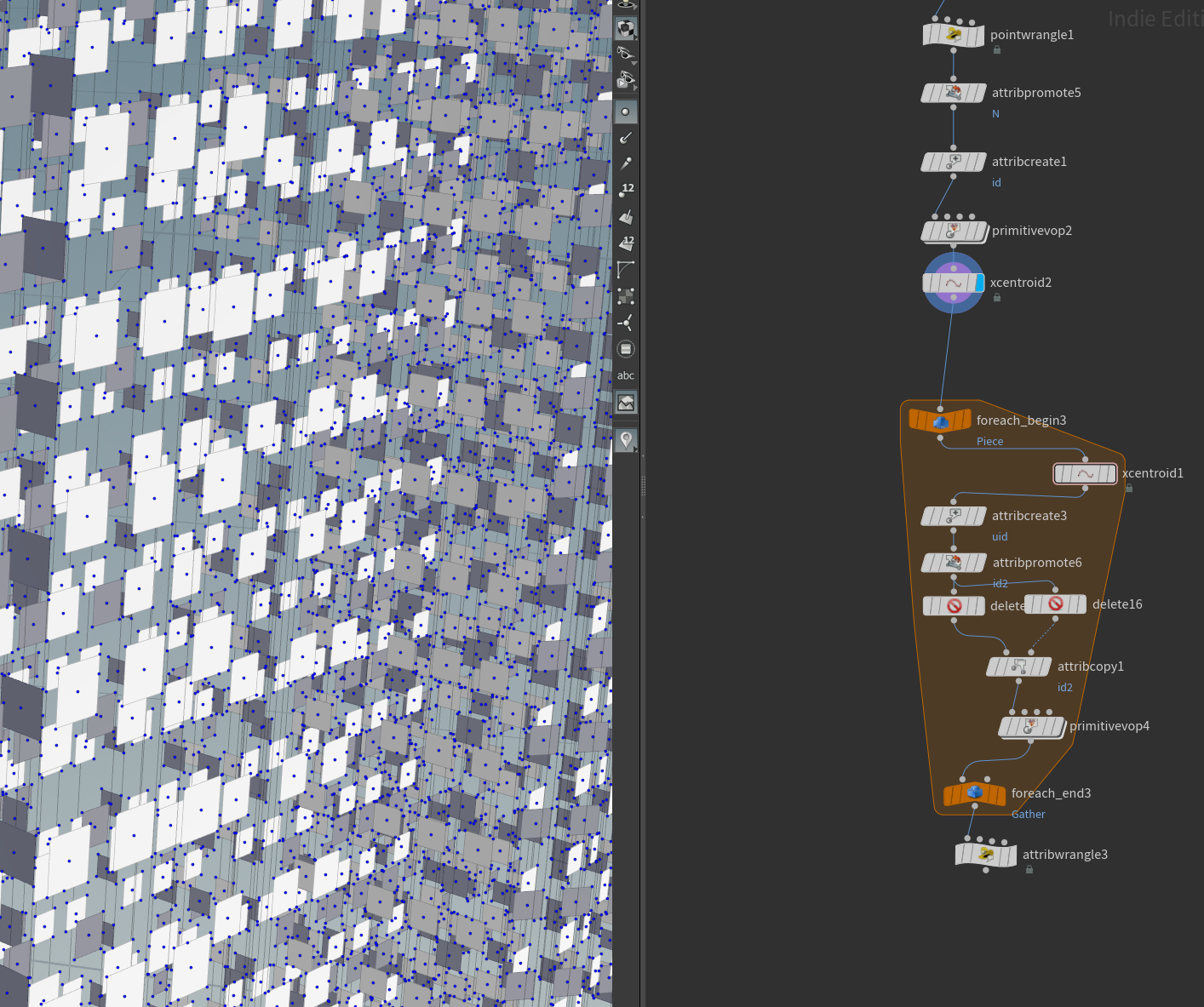
The next process is to find the centroids of these squares and also add normal values so they align correctly to the face under them. I could stop the process here and render the squares as windows but I have found using clones/instances is a bit more GPU friendly.

And finally the centroid points are created and any duplicate geometry deleted. I then attach an instance onto these points which will reference my windows. I have about 5 different types of windows with varying levels of brightness/emission.
This forms the basis of my workflow for creating the cities. The buildings are always over-extruded to create a more dramatic look and I have some tutorials here which might help anyone with ingesting spatial data if they want to use Houdini.
The below is a culmination of a lot of concepts and workflows which I have been researching in Houdini for the best part of two years now.
“New York City with Buses” - Take a little tour around a glossy (exaggerated) #NYC with ~1 hour of bus activity. This took a while to make & sure the windows may obfuscate the data but the added immersion, for me, is well worth it!
My inspiration for the New York piece was obviously the Kalax concept visualisation but also the LAPD approach scene from Blade Runner 2049. Everything about that scene from the mist to the emissive hologram signs in the deep corridors is amazing.
I felt the New York visualisation, whilst lovely, was a little too clean - no atmosphere really. It also suffered from the scheduled data for bus journeys, for anyone who has used this data before you’ll know that scheduled data is just ‘stop to stop’ with no routing along road networks. If you look close you can see the tails clipping buildings and cutting across sections of road.
So I decided to do an update and use Los Angeles data this time - from more accurate scheduled bus journeys to 3d buildings and even street lights. The routing is still based on a ‘stop to stop’ idealised view of bus activity in the city but the journey between stops is now snapped to the road network creating a nicer and smoother animation.
This visualisation also utilises environmental fog to create more atmosphere and has probably been the most demanding project I have rendered to date.
Also there is nothing quite like a ton of glitched frames to make the rendering process smooth! Still, they create an interesting look!
Here are some early concept visuals I made using San Francisco data as well - I was playing CyberPunk at the time which explains the over-the-top nighttime neon vibe!


