TomTom:
Visualising Amsterdam’s Heartbeat
Today TomTom has over 600 million connected devices in use globally. This community generates over 3.5 billion kilometres of GPS measurements every single day and to date TomTom has amassed 48 trillion GPS measurements.
A city such as Amsterdam could be remapped, (starting with nothing) in around 8 mins!
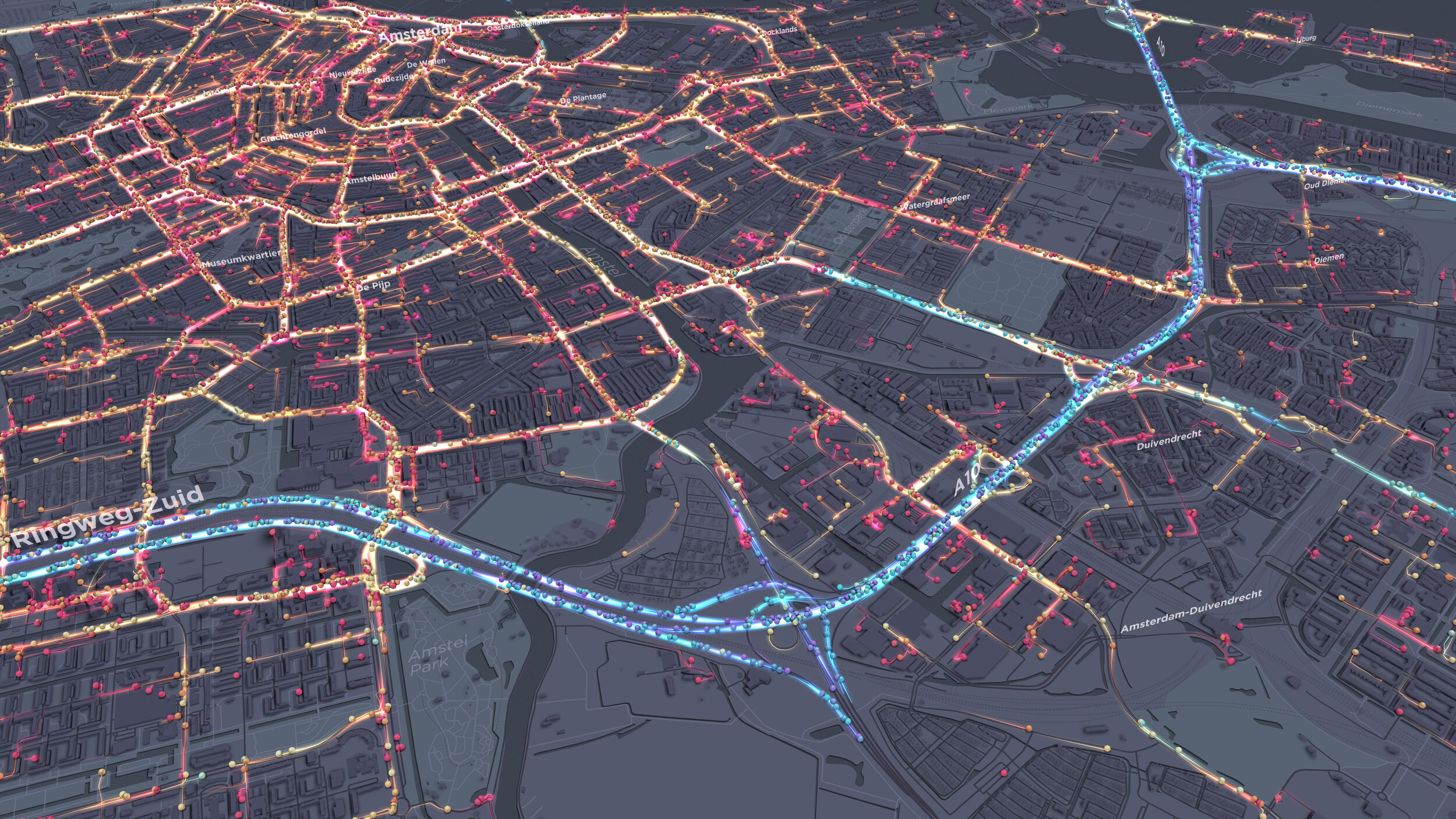
I have been busy in our Ito Design Lab designing a narrative-driven data visualisation that takes you on a tour of TomTom’s probe data for the city of Amsterdam, and it’s been fun!
Check out the final video below:
With such an interesting and large dataset I wanted to pull together a blog on some of the design processes, offcuts and general visualisation styles that helped us sculpt the visualisation you see above.
Storyboard
We initially started working with TomTom and their design team to understand what narrative we wanted to tell and ultimately how their data could help tell a story.
The initial storyboard consisted of a number of phases, or chapters, each one showing data in a new light. Our main goal was to give TomTom a visualisation that helped them convey the richness of their data whilst also looking beautiful.
Chapter 1: Visualising a typical day of probe data throughout Amsterdam with probes categorised by colour and motion in accordance with the traffic speed.
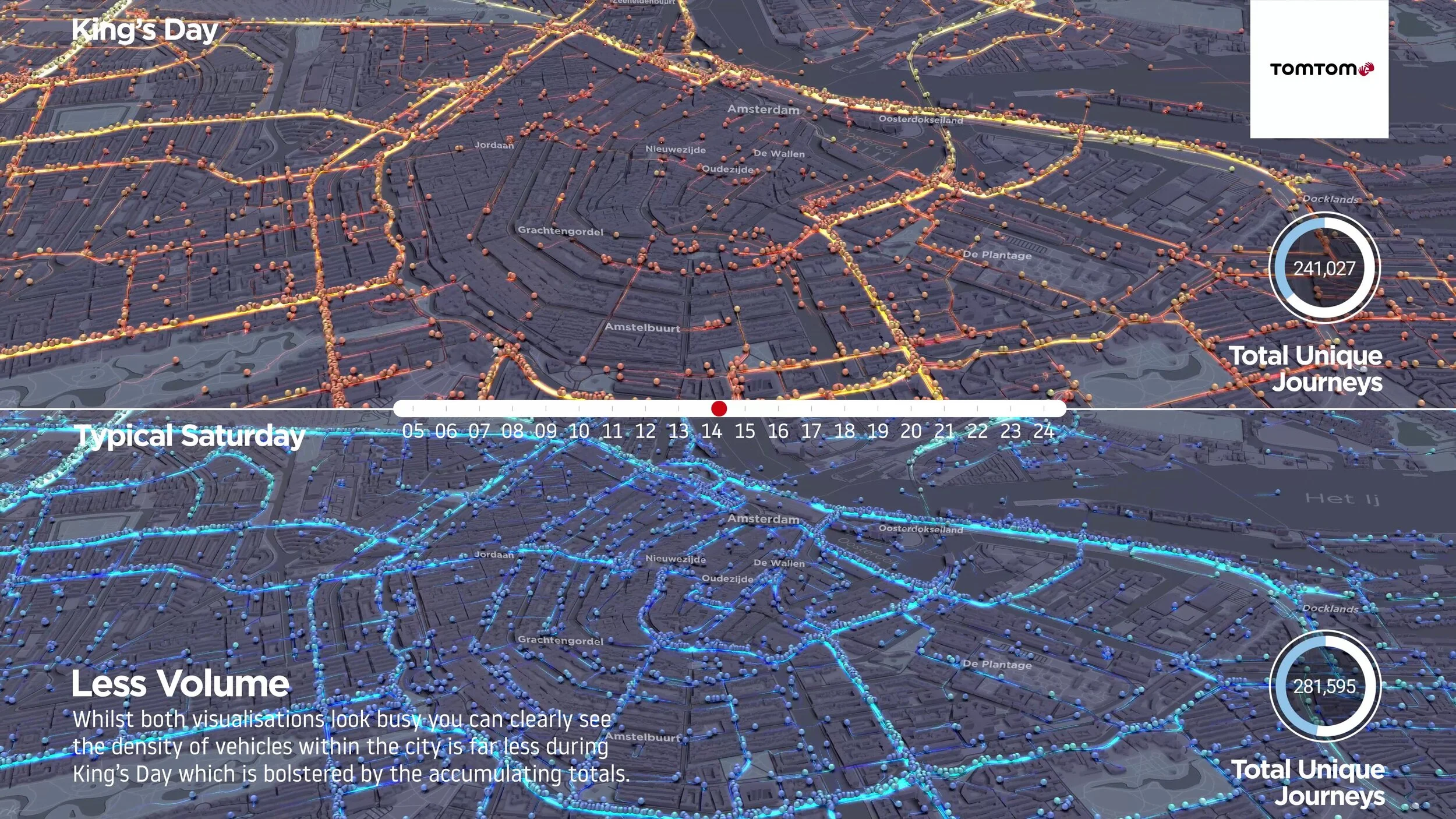
Chapter 2 start: To visually compare how the flow of traffic on a typical Saturday differs from a public bank holiday (King’s Day)
Chapter 2 end: To create a composite overview visualisation of how the two days differ in terms of total flow from each other
Chapter 3 start: To utilise some new innovative visualisation styles to show the explosion of traffic over a single road network and the build-up of congestion on that link throughout the day.
Chapter 3 end: To finish with our signature Coral City visualisation for Amsterdam utilising TomTom’s speed profile data for road networks
Design Process
It is interesting to see the evolution of visualisation styles that we explored throughout the project. I want to use this section to show the various offcuts, ideas and concepts we worked through before we ended up at what you see above.
Early Concepts:
I will talk a little about the idea of a day-night cycle in the next section but we were keen to utilise this idea in some way. As such we started the project developing a number of different visualisation styles suitable for a dark and light palette.
Dark Styles:
3d Plasma Flows
I was quite keen to utilise verticality in some of the initial concepts, I wanted to show the speed profile of vehicle journeys throughout the z-axis, so the faster flows would exist on a higher plane than the slower flows. Here you could see where congestion was building up at junctions and where the flow is fastest. Whilst an interesting look it was a bit noisy and almost jolty in its execution and wasn’t progressed too far.
3d Point Clouds
This style was used quite heavily during initial iterations as I felt it was quite effective although slightly difficult to understand at a glance. Instead of showing journeys we are showing every GPS point that was recorded for a vehicle during an hour banding. The idea here was that you would be able to visualise quite clearly the difference in flow during commuter periods.
3d Gated Point Flows
The third chapter of the storyboard revolved around analysing flow on isolated road networks. Through our internal Ito World (www.itoworld.com) software we can put virtual gates on road geometry and only show flows which pass through this gate. This is incredibly useful for isolating flows on specific roads. The idea here was to utilise height to show the speed profile and accumulate points where speed fell below a certain threshold. This would show the backup or build-up of traffic along a road network over time. You can see here how congestion backs up along this road network over the space of a few minutes. One of the problems here is the disconnect you have with the higher flows being offset from the ground plane, it's not so much an issue when we talk about one road but if you are showing a network it becomes more confusing.
3d Gated Point Wave
This one was more conceptual than other styles, we use a similar method to the above in terms of ‘gating’ a road network but clamp all journeys to start at a zero epoch. The resulting wave shows what would happen if all journeys set off at once and the speed profile variation in where traffic was fastest and where congestion occurred. The wave is a difficult concept to ingest but the idea of showing all journeys start at a specific time is one that made it into our final visualisation.
2d Gated Point Wave
This is the same concept as above but in 2d rather than 3d. For me I find this ‘explosion’ of journeys not only mesmerising to watch but quite interesting in terms of the insight that comes from it. You can immediately see higher speeds along the straight sections of road and reduced speed over the junctions.
Light Styles:
During the early project phase, we also developed a number of light visualisation styles which we would hope to combine with the above to show a day-night theme. Some of these styles are described below.
3d Point Cloud
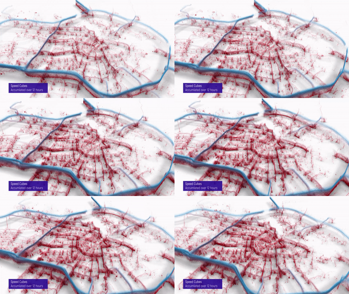
Our first concepts revolved around the 3d point cloud, I liked the idea of making this point cloud a physical entity and so each point is comprised of tiny geometry cloners. The physical presence of the cube allows us to simulate ambient occlusion which gives it that nice shadow appearance. I love this idea but felt whilst it looks beautiful as a piece of data art, the concept of it is tricky to convey. The idea, as described above, is that it shows speed profile, you can clearly see the ring roads and the density of slower speeds along some of the arterial roads and into the centre of the city. However, the density of points, coupled with the physical presence of them makes it difficult to see what is behind some of the fences.
The above shows the point cloud in action, this is showing accumulating positions over time banded in 1-hour slots. Whilst it shows some interesting patterns, for users who aren’t used to seeing complex data visualisations it is a little tricky to grasp and so was disbanded as a concept early on.
Lollipop Cubes
For lack of a better name these speak for themselves, each journey is symbolised by a cube with a corresponding leader line showing its position relative to the ground plane. This was an attempt to rectify the idea connection issue between a floating-point and the ground. The name aside, it was a neat idea but didn't make the final cut!
Day Night Cycle
One of the initial concepts we toyed with on this project was how to simulate a day-night cycle. Tone and pallette choices have a huge effect on our visualisation styles and how we portray certain datasets.
For instance, if we want a bright white basemap to simulate day, we would tend to use 3d elements (spheres, cubes) that have a weight and volume to them so we can simulate shadows through ambient occlusion. This gives a real-world lighting effect to the visualisation and ultimately helps give it depth and texture.
If we wanted to show ‘light-trails’ or as we call them ‘plasma flows’ we would aim to use a darker basemap so that the glow effects and additive blending of the light omissions show up nicely. This effect would be lost on the light basemap above.
So if we were to simulate an extreme case of day-night or light-dark we would need to look at creating two visualisation styles which are quite distinct from each other. The problem here is continuity - we wanted a user to understand the shift into the night without having to track a clock but at the same time be comfortable in understanding the dataset is the same. Some of our initial tests proved that this wasn’t effective and so we tempered the extremes of day-night to a more similar palette — one which supported one visualisation style.
So as you can see below our day palette uses the same viz style for vehicle flow yet it is a subtly lighter than the evening palette. We also used some lens flares to simulate the switch from day to night which helps a user comprehend when they are seeing the evening peak flow in traffic.
Day palette with sun glare
Evening palette with moon glare
Final Cut Styles:
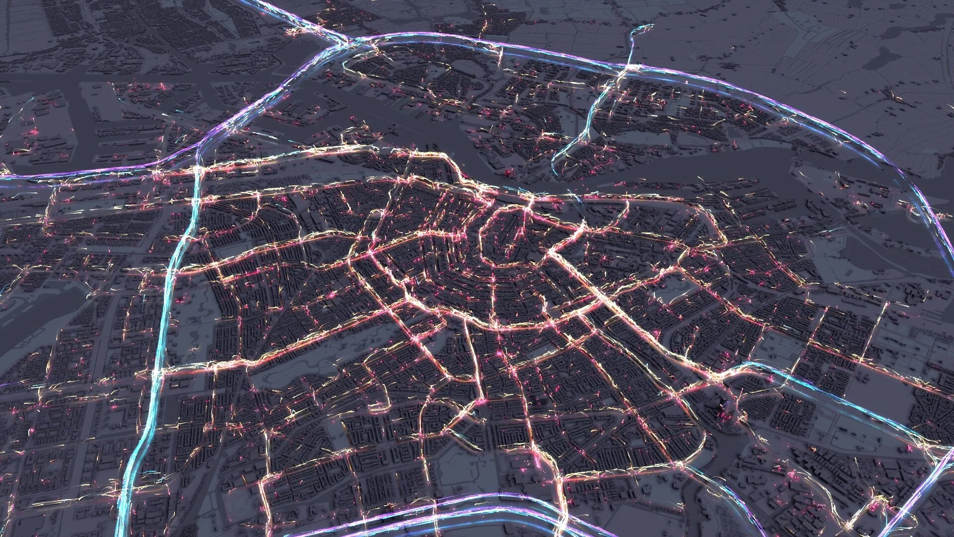
The final cut visualisation benefited from the evolving styles we developed and utilised a way to show flow that;
a) has an element of 3d
b) utilised light emissions for the light trails
c) utilised colour and motion to depict the speed profile.
All of our experiments in trying to visualise speed on a z-axis concluded that unless the z scale was dampened massively there was too much of a disconnect between the higher speeds and the ground plane. So we decided to clamp everything to the floor and utilise sphere and light trails to show vehicle flow.
Sphere flows with light trails
Sphere flows with light trails
This style is used throughout all three chapters to varying degrees, during Chapter 2 as you see below we colour to show speed along two gradient profiles significant to the day shown (orange, of course, being King’s Day).
The variation in speed is a little more difficult to see with these gradients however it is the density of flow which we want the user to look at. It’s clear there is less traffic in the centre of Amsterdam during King’s Day, presumably while people celebrate. We try and bolster this with the metric dials and the ‘Total Unique Journey’ counter rising in both.
However to make sure the distinction is made clear towards the end of the visualisation we show a composite view of the difference in flow between the two days, over the whole day.
The blue pillars show areas where the ‘binned’ flow of a ‘Typical Saturday’ exceed that of the flow of ‘King’s Day’. The orange pillars show the inverse of this, so where King’s Day flow is higher than a typical Saturday. We felt this delta was the most useful comparison rather than showing absolute values for daily flow.
Chapter three uses a slightly different approach to visualise vehicle flow yet utilises a similar style for continuity. The idea here was to isolate three road networks and have a closer look at their speed profiles and more importantly where congestion accumulates along that network.
We iterated on one of the previous visualisation styles to create a kind of ‘explosion of journeys’ all originating from a zero epoch time and propagating out along their trajectories. Faster flows would travel out first and whenever a vehicle went under 10km/h it’s GPS position was accumulated on the map to show a sort of heat map of where congestion occurs. An example of this is shown below.
I was really happy with this effect, so much so in fact, I produced a larger small multiple version of multiple road sections throughout Amsterdam. These were chosen at random so aren’t indicative of the most congested road segments.
And the final style which made it into the viz by request of TomTom was our signature Coral Cities. I was so pleased by the request to include what has become a bit of a signature viz style for me. Moreso perhaps because it has given us a chance to use real speed profile data which resulted in a far more organic and accurate depiction of drive time catchments.
The below image is our Coral City utilising OpenStreetMap and its corresponding road speeds. It doesn't take into consideration congestion and uses road hierarchy as a proxy for finding the best routes in and out of the city. As such you get an even distribution of the coral formation along the road links.
The below is the Coral City utilising TomTom’s road geometry and Historic Speed Profile data which gives average weekday speeds for links in the network. The result is a far more organic depiction of how the road network behaves in Amsterdam, with thicker arteries along road networks which have less congestion and better speed profiles.
And here is the link to the final video again, in case you don't fancy scrolling to the top of the blog!
Hopefully, the blog is an interesting insight into our design process at Ito World.
For more info on what we do visit www.itoworld.com or get in touch at info@itoworld.com.


