Mini Abstract Mountains
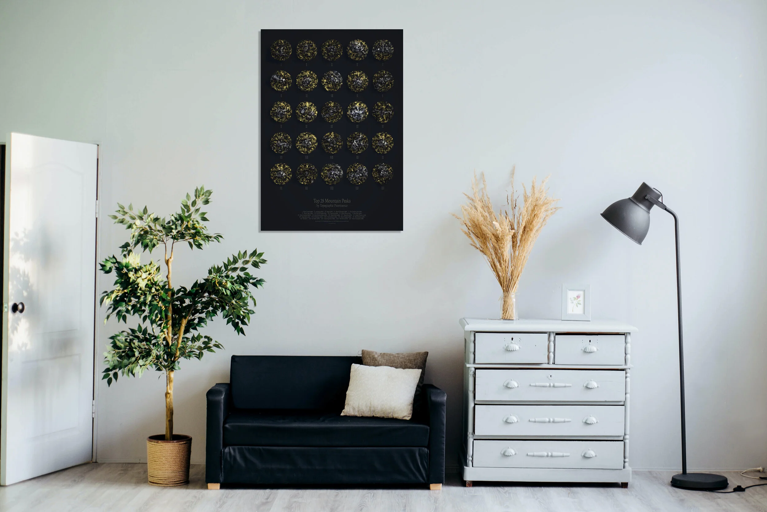
An abstract depiction of an old project ‘Top 25 Mountain Peaks - by Topographic Prominence’
I love experimenting with topography and one of my favourite projects still remains this 2017 project visualising the ‘Top 25 Peaks – by topographic prominence’ as tanaka contours.

I decided to update this in 2019 with a more abstract depiction of the mountains using ‘atomised low-poly’ tools in Cinema4D which created a nice aesthetic.
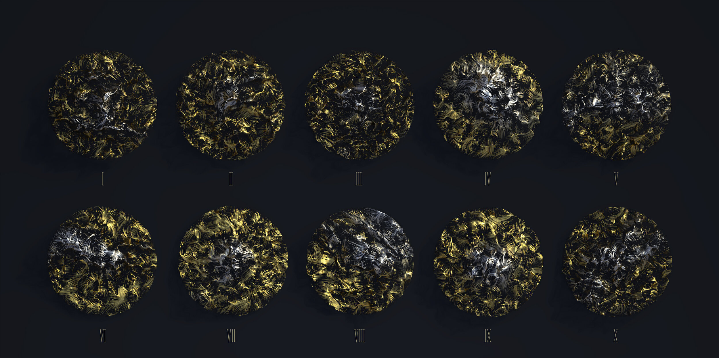
This year I seem to have veered even more towards abstract DataArt and so decided to really push the boat out with the 2020 version. Using Houdini and it’s vast toolset I decided to turn each mountain mesh into ‘abstract ribbon contours.’

The ribbons themselves don’t necessarily conform to typical contours, they are created by spawning thousands of points on top of a 3d mountain mesh and utilise ‘popnet’ and ‘ray’ tools to clamp the movement of the particle system to the nearest point on a mesh. As the particles travel into the air from the mesh they are clamped to the nearest point on that mesh which usually favours peaks rather than valleys. The swirls and patterns you see are the movement of particles in the air but clamped to the mesh. The resulting swirls all conform to the mountain topography and as such appear as abstract ribbon contours.

Opting for a top-down view meant that the abstract nature of the swirls had a very tenuous link with what the mountain actually looks like. To remedy this I utilise a slight gradient emphasising where then peaks are, so there is at least some connection to the mountains themselves.
However abstract is my goal here - I wanted to create something unique that is not only derived from data but that would also look nice mounted in a frame on a wall. I like the idea that these designs are so abstract it takes you a moment of two to realise what they are. The subtle variance in turbulence from one mountain to another is slightly dictated by their topographic form but is not constrained by it, so the swirls flow freely over the mesh.
Producing something you are happy to go on a wall is a tricky thing so I decided to work on a number of colour schemes as highlighted below. Personally, I find the ‘gold foil’ on black most elegant and minimalist.

The below are my final images! I spent too long debating whether to go for 3d text or flat vector text for the labels. In the end I compromised with 3d text for the ‘gold on black’ design and flat vector text for the remaining designs. I feel like the 2d vector version is a little cleaner and easier to read for the description box below.


A note on Topographic Prominence
I like the idea of visualising topographic prominence, I felt it led to the most visually interesting peaks of the top 25. For those who are unfamiliar with the term, topographic prominence is described as:
The prominence of a peak is the minimum height of climb to the summit on any route from a higher peak, or from sea level if there is no higher peak.
The source for this list is found here: https://en.wikipedia.org/wiki/List_of_mountain_peaks_by_prominence and www.peaklist.org. All of these mountains were derived from SRTM 90m and Vinson Massif (Antarctica) has been omitted due to lack of data to create the mesh.
What’s next?
Personally I would love to print some of these posters as I think they would look great mounted, similar to my very rubbish examples below.
I’m not sure how niche the design is for wider appeal but if folk do like it then I could explore some print options i.e. Society6 or sourcing printing myself - not sure yet.